Stock photos can absolutely help your website convert, but only when they’re used with intention. The goal isn’t to sprinkle pictures everywhere like confetti and hope visitors feel inspired. The goal is to use visuals as conversion tools: to build trust, guide attention, reduce friction, clarify value, and make your site feel credible and easy to navigate.
When used well, stock imagery can do three important things for conversions:
It helps people understand what you do faster
It makes your brand feel more established and trustworthy
It creates emotional alignment, so visitors feel like they’ve landed in the right place
When used poorly, stock images can do the opposite. Generic, staged photos can signal low effort or create skepticism, which hurts conversions. So let’s talk about the best places to use stock photos on your website and how to use them in a way that supports sales, sign-ups, and bookings.
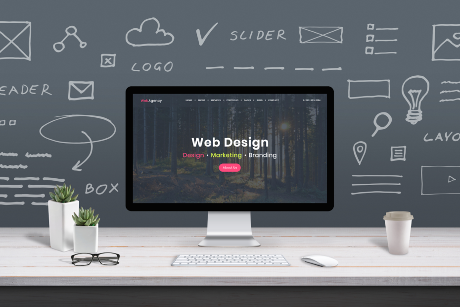
1) The Homepage Hero Section (But Only If It Matches the Story)
The hero section is your first impression. It’s where visitors decide, often in seconds, whether to keep reading. A strong hero image can immediately communicate mood and relevance.
How stock photos help here:
They set the tone (calm, premium, energetic, friendly)
They establish a world your audience relates to
They create a “this is for me” feeling quickly
What to avoid:
Overly staged smiles
Generic handshakes
Images that could belong to any industry
How to do it right:
Choose images that reflect your customer’s desired outcome or situation. If you help busy professionals, show focused work, real desks, planning moments, hands-on keyboards, or peaceful work environments. If you sell home products, show cozy, real spaces with believable lighting.
Conversion tip:
Overlay a clear headline and a focused call-to-action. Use a subtle dark or light overlay so the text is readable without making the image look muddy.
2) Section Headers That Break Up Long Pages
Long pages convert when they’re easy to scan. Images can act like “visual signposts” that keep visitors moving and prevent fatigue.
Where to use stock photos:
Between major sections on service pages
Above FAQs
Before pricing blocks
At the start of a case study section
How to do it right:
Use consistent image style (lighting, color tone, composition). Choose images with negative space so they don’t compete with your text.
Conversion tip:
Treat section images like punctuation. One strong image at a transition point is often better than many small images sprinkled randomly.
3) Your Services Page: Use Process and “Hands at Work” Imagery
Service pages often struggle because services are intangible. Stock photos can help make a process feel real and understandable, even if you don’t have custom photos yet.
Best stock photo types for services:
Hands writing notes
Planning sessions
Tools of the trade (realistic ones)
Screens, sketches, notebooks
Candid collaboration moments (not posed)
How to do it right:
Choose images that visually match your steps. If you have a 3-step process, show three images that correspond to those stages. This makes your offer feel structured and reliable.
Conversion tip:
Pair each image with a concrete micro-promise: “Clear next steps,” “Fast turnaround,” “No jargon,” “Weekly updates.”
4) Testimonials and Social Proof (Use Images Carefully)
Testimonials are high-conversion elements, but they can feel fake if paired with obviously staged imagery of strangers. If you don’t have real customer photos, there are still ways to support testimonials visually without harming trust.
Better than random smiling faces:
Abstract textures (paper, soft gradients)
Your product detail shots (if you sell products)
Environment shots that match your brand (cozy desk, calm home)
Icons or badges paired with clean layout
If you do have real photos:
Use them. Even phone photos can increase trust when they’re authentic.
Conversion tip:
If you use stock imagery near testimonials, keep it subtle and avoid implying the person in the image gave the testimonial.
5) The “About” Page (Use Stock Photos as Support, Not the Star)
Your About page is a trust page. It’s where visitors decide whether you’re real, credible, and aligned with them. Ideally, you’d have at least one real photo of you, your team, your workspace, or your product. But stock photos can still help fill in the atmosphere and clarify your values.
Good uses of stock on About pages:
Background images that reinforce your brand vibe
Detail shots that match your story (tools, materials, work environment)
Lifestyle imagery that reflects your customers’ world
What to avoid:
Using only stock images on an About page with no real anchors at all. That can feel slippery.
Conversion tip:
Add at least one authentic element, even if it’s small: a simple real headshot, a behind-the-scenes phone photo, or a photo of your workspace.
6) Product Pages: Lifestyle Context (If You Sell Products)
Product pages convert better when buyers can imagine the item in their life. Stock photos can help provide that lifestyle context, but your actual product images should still be real.
Where stock photos help:
Banner images at the top of category pages
Mood shots in “collections” pages
Lifestyle sections like “Perfect for…” or “Pairs well with…”
Conversion tip:
Use stock images to reinforce the lifestyle and feeling, but keep your product photos accurate and prominent. If you use stock imagery too much on product pages, it can create doubt about what customers will actually receive.
7) Blog Post Templates: Inline Images That Improve Readability
Blogs convert when people stay long enough to build trust. Inline images can increase engagement by breaking up text and adding visual clarity.
Best uses of stock photos in blog content:
Step-by-step visuals that match the topic
Concept illustrations (workspace for productivity, cozy home for decor)
Section breaks and “moment” images that keep the reader scrolling
Comparison visuals and examples
Conversion tip:
Use consistent photo styles and consistent placement. For example, one image every 300–500 words, aligned with the section it supports.
8) Lead Magnet and Email Signup Areas
Opt-in boxes convert better when they feel like a real offer, not a pop-up begging for attention. Stock images can make an opt-in look like a mini product.
Ways to use stock photos:
A cover-style image for your free guide
A subtle background texture behind the sign-up form
A small image next to bullet benefits
Conversion tip:
If you’re offering a downloadable guide, design a simple “cover mockup” using an image background and bold title text. It makes the freebie feel more valuable.
9) Pricing Pages: Use Calm, Confidence-Building Imagery
Pricing pages can create anxiety. The goal is clarity and calm. Stock photos can support that mood, but pricing is mainly a design problem, not an image problem.
Good stock imagery for pricing pages:
Minimal textures
Clean environments
Subtle detail shots
Soft backgrounds that don’t distract
What to avoid:
Big, emotional images that pull focus away from the pricing table.
Conversion tip:
Use imagery sparingly on pricing pages. Keep attention on the decision.
10) FAQ Pages: Visual Support for Clarity
FAQs can feel like walls of text. Adding small images can make them easier to scan and more approachable.
Good image choices:
Icons paired with subtle background images
Small photos that match the theme of the question category
Simple dividers using a thin photo strip texture
Conversion tip:
Group FAQs by category and add one image per category rather than one per question.
11) Contact and Booking Pages: Make the Next Step Feel Safe
Contact pages convert when they reduce uncertainty. Stock photos can help set a welcoming tone, but they should not feel staged or salesy.
Good image types:
Calm, real workspaces
Hands writing, scheduling, planning
Warm, neutral environment shots
Conversion tip:
Add a photo that reinforces your promise: “Fast response,” “Clear next steps,” “Friendly support.” Then back it up with specifics like response time and what happens after they submit.
12) Confirmation Pages: Reinforce the Decision
This is a missed opportunity on many sites. After someone signs up, purchases, or books, you can use stock imagery to reinforce the decision and guide them to the next step.
Examples:
A calm celebratory image with “You’re in!”
A helpful visual with next steps
A small branded image that makes the confirmation feel polished
Conversion tip:
Use the confirmation page to direct a second action: follow on social, download the guide, check your email, or browse a popular resource.
13) Pop-Ups and Banners (Use Small Images, Not Clutter)
Pop-ups can convert, but they can also annoy. Stock images can make a pop-up feel more like a designed announcement and less like a desperate interruption.
How to do it right:
Use small, subtle images or textures rather than large, distracting photos. Keep it clean and readable.
Conversion tip:
Let the offer do the work. The image should support clarity, not steal attention.
14) The “Consistency Rule” That Makes Everything Work Better
Even if you choose great images, conversions suffer when your site looks inconsistent. Your images should feel like they belong together.
Consistency checklist:
Similar lighting style across the site
Similar color temperature (warm vs cool)
Consistent crop ratios
Consistent placement in page layouts
A light, consistent edit approach
When everything feels cohesive, your brand feels more trustworthy, which helps conversions.
15) The Bottom Line: Use Images as Conversion Tools, Not Decoration
Stock photos can improve conversions when they support the visitor’s journey: setting mood, clarifying meaning, building trust, and guiding attention. The best places to use them are where people make decisions or need clarity: hero sections, service pages, opt-in areas, blog content, and booking pages. The key is choosing images that look authentic and applying them consistently so your website feels designed, credible, and aligned with your offer.
If you tell me what type of website you have (service business, e-commerce, personal brand, local business) and your primary conversion goal (book calls, sell products, email signups), I can recommend a simple “image placement plan” for your top 5 pages and the types of imagery that will work best for each.